Professional Eye Care Associates


Professional Eye Care Associates wanted a modern re-vamp for their existing brand. They didn’t want to reinvent their image, but bring their brand to life with modern typography and a more inviting color palette. We chose to keep their existing logomark and pair it with new typography that families well with the structural qualities of the logomark.
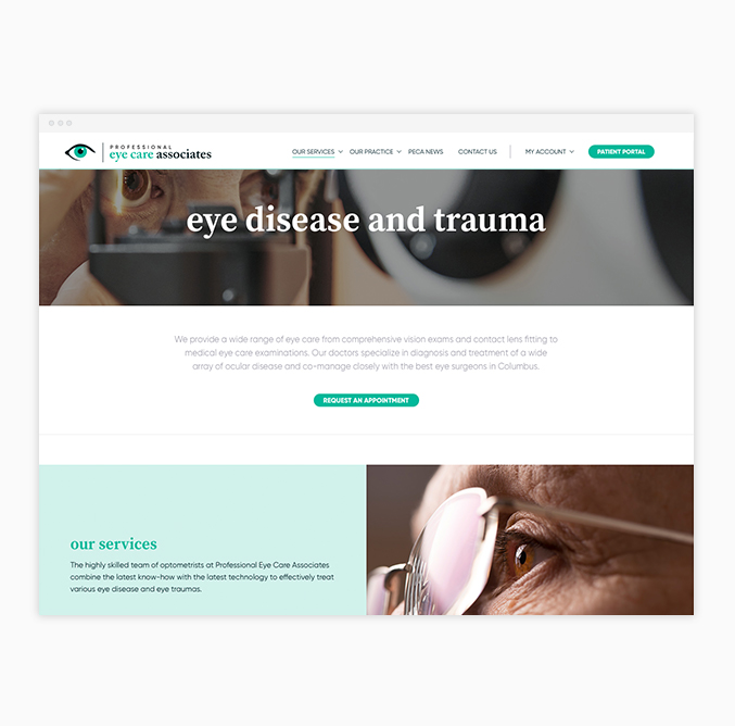
We designed them an updated website that allows new patients to quickly understand their practice and gives existing patients the ability to quickly access relevant information, such as requesting an appointment. The redesign improved the site informationally, technologically and visually, giving them a site that works effectively with purpose.


Creative Strategy
Digital Strategy
Brand Design
Creative Direction
Illustration
UI/UX Design
Visual Design
Wordpress Development
Monitoring & Support
